

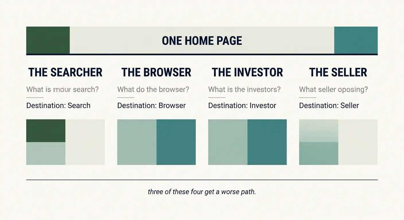
Same client. Same list. Home, inventory, about, contact.
If I build that list, I've built a filing cabinet. Four drawers with no instructions on which to open first.
However a website is a conversation. The visitor arrives with a question. The site answers it and hands them the next question. The pages are where the conversation happens, but the order matters (more than any single page), because if the page answers the wrong question, it’ll upset the rhythm and force the visitor to have to think about how to continue and if he or she wants to continue.
Let’s say someone lands on SuClasico’s home page, because they searched for a 1967 Mustang Fastback.
You would hope they would land on the vehicle detail page (VDP) but search engines don't always do what we hope they’ll do. So they're on the home page and wondering if this site is worth their time.
The hero has seconds to help them decide. If it's a showroom photograph and the words "Welcome to SuClasico," they’ll leave, because the site hasn’t told them anything they couldn't have figured out from the search result.
Put the 1967 Fastback in the hero instead, and change the headline to "We've got your Mustang!" Same page. Same layout. Different hero. Now the home page has answered the question the visitor was asking.
The difference isn't how it looks. It's whether this page knows which page is the best page to continue the conversation.
They're on the VDP now. Photos, price, mileage, phone number. That's what every dealership website gives them, and it's also where every dealership loses them, because the visitor has to decide, contact them now or wait. Most wait. They'll leave the tab open, keep searching, and never come back to it.
So we need to give them a reason to stay, something they can't get from the price and photographs.
For SuClasico, We could build a configuration tool. Pick the engine, the paint, the wheels, the interior, and watch the number change as you go. Somewhere in the middle of that they'll want to save the build, because they want to show the wife, a friend, sleep on the colors, or come back to it tomorrow.
Saving requires an email address, and now I have one that I wouldn't have gotten from a newsletter signup popup.
That tool changes what the VDP has to do. It's no longer the page responsible for answering every question. Its job is to get the visitor into the tool, and its the tools job to keep answering questions, many of which the visitor didn’t even know they had.
Which means three lines above the fold, we need to make the case for building something rather than buying off the floor.
However building something like this would take some time. SuClasico is a small shop. And somebody has to maintain it because prices change, parts go out of stock, and paint options shift. A broken configurator is worse than no configurator. If the owner can't commit to looking after it, it’s better not to build it, so we might need to rethink the VDP.
The decision about whether to build the tool isn't a design decision and it isn't a development decision. It's a question about who owns it after it’s built, and the answer changes what the page is allowed to do. That's the kind of problems that show up when you're designing the path rather than the page.
The contact page has the same problem. Three kinds of people end up there. One wants to ask about a specific car. One wants to sell their own. One wants to book a visit. Give all three a single form with a message field and they each have to work out what to write, and most won't. Three short paths, each labeled for one of them, and the form becomes the next step in a conversation.
Each page carries a piece of the conversation for the pages around it. That's the idea.
Each page has a purpose in the chain of events verses designing each page in isolation. Home page gets the big hero. About page gets the history. Contact page gets a form. Nobody asks what the visitor needs between them. Every page passes whatever test you apply to a single page. The site still doesn't work.
No body can catch it in the website reviews, because nothing is broken. The SEO lands a visitor on a page that doesn't know where to send them. The developer builds a form that collects a message nobody routes. The designer designs a hero for a question nobody’s asking.
The reason a generated website tends to feel like a filing cabinet is because the pages are it’s job. Ask for a home page, you get a home page. Ask for an about page, you get an about page. The model answered the prompt, and the prompt was the list. It’s faster, cheaper.
When you sketch the flow before you sketch the page, it’s slower. You ask what the visitor brings to the page and what they need to leave with, and then you ask the same question about the page you're sending them to.
That's an afternoon with a whiteboard before anyone opens a design tool.
When you're designing a website, you're not building pages. You're building a path through a set of questions the visitor is asking. The pages are where the questions get answered. The connections are what make the answers useful, and the connections are the part that has to survive contact with a real business, a maintenance budget, a person who answers the phone, an inventory that changes while you sleep.
Before any of this can be designed, you have to know what pages exist and what each one is for, and that's a planning problem, not a drawing problem.

0 Comments
No comments yet — be the first.
Log in to leave a comment.